Colors play a crucial role in design, branding, and user experience (UX). While vibrant colors grab attention, muted colors are making a powerful statement in modern design. These soft, desaturated hues create an elegant, sophisticated, and calming aesthetic, making them highly effective in branding, UI/UX, web design, fashion, and marketing.
In this guide, we’ll explore the importance of muted colors, how to create them, and their application in various industries—helping you craft a visually stunning and user-friendly experience.
What Are Muted Colors & Why Use Them?
Definition of Muted Colors
Muted colors are desaturated hues with lower vibrancy, often achieved by mixing colors with gray, black, white, or complementary colors. These tones appear softer, natural, and harmonious.
Muted Colors vs. Vibrant Colors
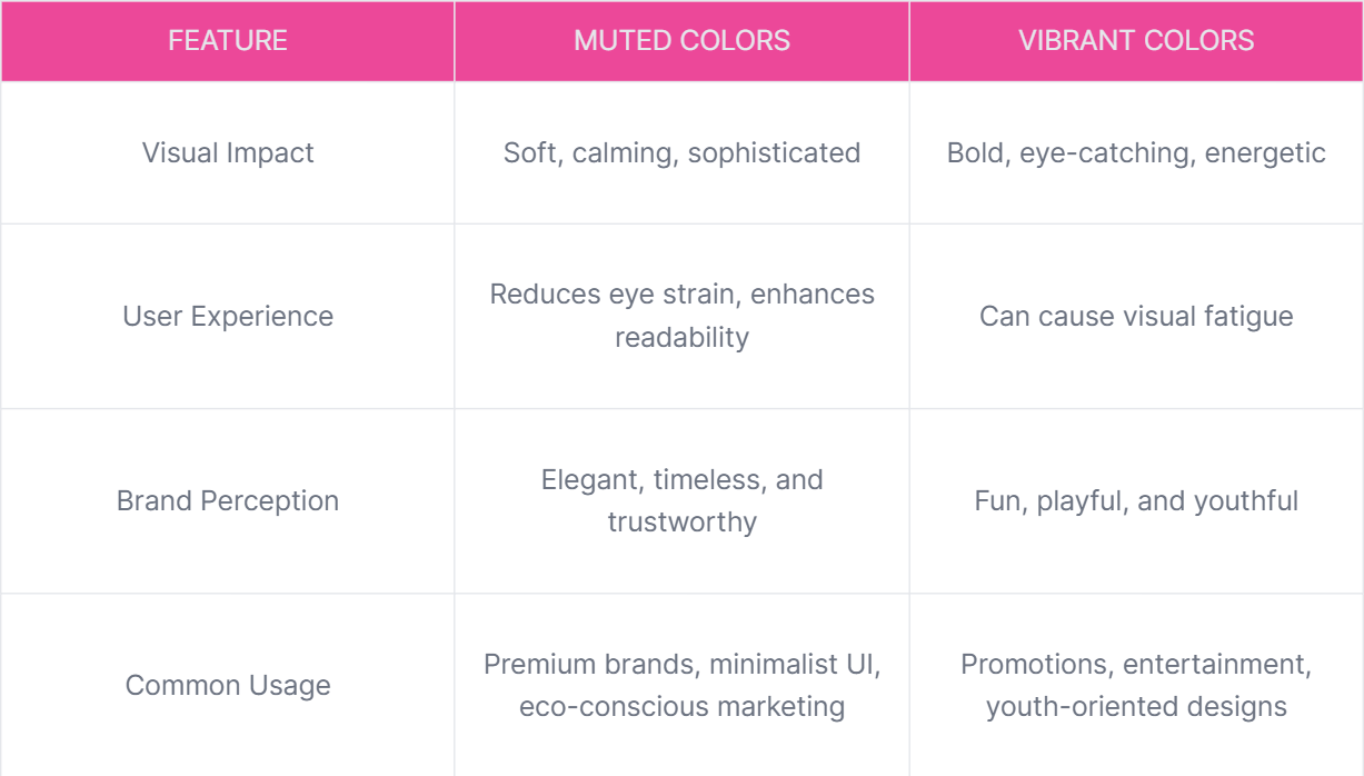
Why Designers Love Muted Colors
✅ Creates a Tranquil Atmosphere – Soft, natural aesthetics improve user engagement.
✅ Enhances Visual Balance – Prevents overwhelming visuals and ensures harmony.
✅ Improves Readability – Text and UI elements stand out effectively.
✅ Elicits Emotional Connection – Evokes warmth, nostalgia, and trust.
How to Create Muted Colors?
Techniques for Muting Colors
- Adding Gray – Softens the hue without altering its essence.
- Mixing Complementary Colors – Blending opposites on the color wheel for balance.
- Using Tints & Shades – Adding white for a pastel look or black for a deeper tone.
- Blending with Earthy Neutrals – Incorporating beige, taupe, or ivory.
- Digital Adjustments – Lowering saturation in tools like Adobe Photoshop, Illustrator, or Figma.
Muted Color Palette Examples with Hex Codes
- Dusty Rose (#b18ea9)
- Olive Green (#6b8e23)
- Muted Teal (#508b8b)
- Faded Lavender (#a899e6)
- Soft Gray (#b0b7b9)
- Mustard Yellow (#d3a427)
- Sage Green (#a9b7a9)
- Vintage Peach (#d39e6b)

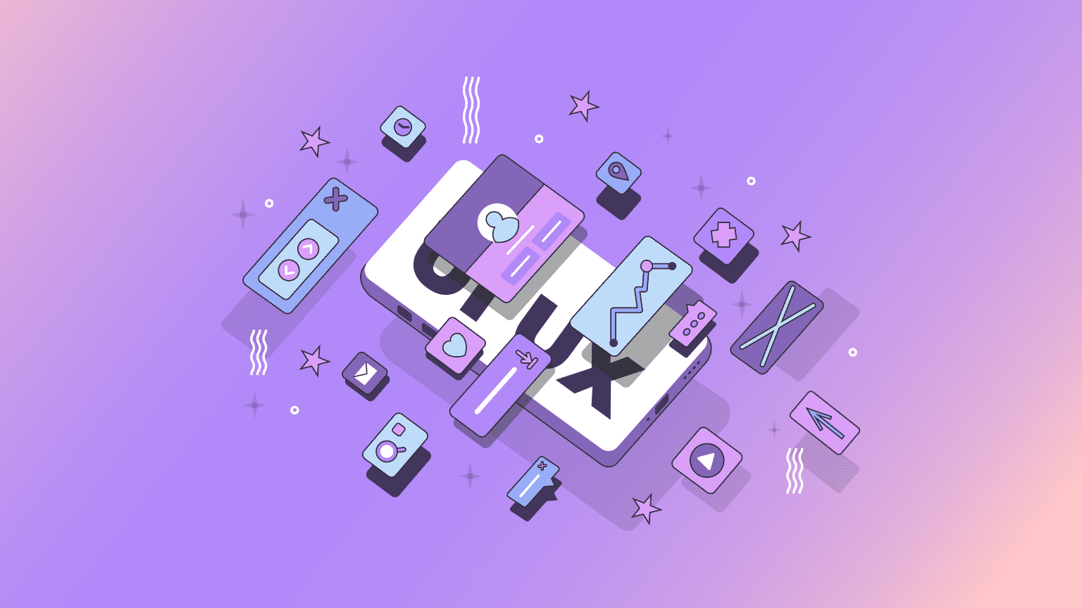
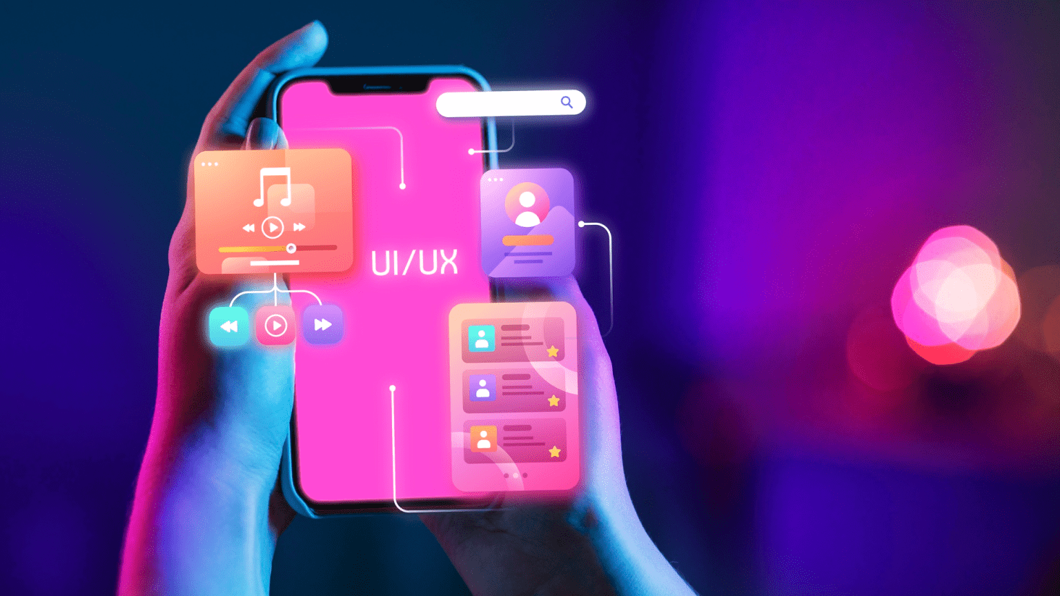
Muted Colors in UI/UX Design
Why UI Designers Prefer Muted Colors
- Minimalism & Simplicity – Reduces distractions and enhances focus.
- Better Accessibility – Increases readability and reduces eye fatigue.
- Sophisticated & Modern Appeal – Ideal for premium brands, fintech, and healthcare apps.
Examples of Brands Using Muted UI Colors
✅ Instagram (Dark Mode) – Uses muted blues and grays for comfortable viewing.
✅ Airbnb – Soft neutrals and earthy tones for a welcoming feel.
✅ Zara Home – Minimalist muted colors for a high-end appeal.
Best Practices for Using Muted Colors in UI/UX
- Use muted backgrounds to let key elements stand out.
- Pair muted colors with bold accents for contrast.
- Ensure accessibility compliance with sufficient contrast ratios.
Also read
The Power of Muted Colors in Branding & Marketing
Why Brands Are Shifting to Muted Colors
- Luxury & Elegance – Preferred by high-end brands like Chanel and Gucci.
- Calm & Trustworthiness – Used in wellness brands like The Honest Company.
- Sustainability & Nature – Popular among eco-conscious brands like Patagonia.
Muted Colors & Brand Storytelling
- Evokes emotions like nostalgia and warmth.
- Creates a more organic and authentic look.
- Softens aggressive marketing visuals for an inviting feel.

Case Studies: How Muted Colors Transform Industries
Healthcare: Soothing UX for Patients
- Challenge: A healthcare mobile app needed a calming, trust-building color scheme.
- Solution: Used sage green, soft blues, and muted grays.
- Result: 40% increase in patient engagement and reduced anxiety levels.
Transportation: Minimalist Interface for Easy Navigation
- Challenge: A ride-hailing app required a professional, intuitive interface.
- Solution: Integrated muted navy blues and warm grays for a modern look.
- Result: 30% boost in customer retention due to reduced cognitive load.
Energy: Eco-Friendly Branding with Muted Earth Tones
- Challenge: A sustainable energy company wanted to highlight its mission visually.
- Solution: Used muted browns, soft oranges, and olive greens.
- Result: 25% increase in brand trust and customer loyalty.
Fashion: Subtle Elegance for a Premium Experience
- Challenge: A luxury fashion e-commerce store needed a high-end aesthetic.
- Solution: Designed a UI with vintage peach, dusty rose, and soft gold.
- Result: 45% growth in user engagement and reduced cart abandonment.

How to Choose the Best Muted Color Palette for Your Design
Types of Muted Color Schemes
- Monochromatic – Single muted hue with variations in lightness/darkness.
- Analogous – Three muted colors that sit next to each other on the color wheel.
- Complementary – Opposite muted colors for contrast.
- Triadic – Three evenly spaced muted colors for visual harmony.
Choosing the Right Palette Based on Industry
- Tech Brands – Muted blues, grays, and soft greens.
- Luxury & Fashion – Dusty rose, muted gold, and vintage peach.
- Healthcare & Wellness – Sage green, soft blue, and neutral grays.
Conclusion & Call to Action
Muted colors are not just a design trend—they're a strategic choice for improving usability, branding, and user experience. Whether you’re designing a website, an app, or a brand identity, muted colors bring depth, sophistication, and balance.
Looking to integrate muted colors into your next project? 🎨 Peacock India specializes in UI/UX, branding, and digital design solutions. Contact us today for a free consultation!


