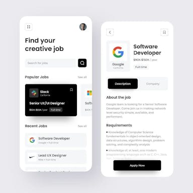
In UX UI design, the “banana rule” is a simple yet powerful principle for optimising user experience. Like a banana’s instantly recognizable shape, effective designs should clearly communicate their purpose at a glance. This article will explore how following the banana rule leads to more intuitive, user-friendly digital products.
The importance of first impressions
The banana rule primarily applies to a website or app’s homepage. As the first touchpoint for users, a homepage must immediately convey what the product is and does through its layout and visual design. A cluttered, confusing homepage fails to make a strong first impression. Just as no one would mistake the function of a banana, your product’s purpose should be visually self-evident.

Creating a clear visual hierarchy
To apply the banana rule, designers should establish a clear visual hierarchy on the homepage. This means displaying the most important elements – like headings, calls to action and navigation – more prominently through size, color and placement. Supporting content appears lower in the hierarchy. This hierarchical approach focuses users’ attention on key information and interactions.
Also read
Keeping navigation intuitive
Navigation elements like menus and buttons must be easy to locate and understand. Consistent navigation that appears on all pages helps users orient themselves within the site or app. Breadcrumb trails provide further wayfinding support. Intuitive navigation allows users to find what they need quickly.
Eliminating clutter
Adhering to the banana rule also means eliminating unnecessary clutter. Every element should serve a purpose relevant to users’ key tasks and goals. Superfluous content that distracts from core functionality violates the streamlined simplicity of the banana rule.

Boosting user experience and conversions
UX design has concrete impacts on business success metrics. When the banana rule is ignored, users struggle to use the product, abandoning it in favor of competitors with more intuitive experiences. By contrast, banana rule-compliant designs encourage engagement and conversions. When products are easy to use, customer satisfaction and loyalty rise.
In summary, the banana rule provides an invaluable lesson – good UX is recognizable at a glance. By honoring this principle, designers can craft experiences users intrinsically understand and enjoy. A “peelable” UI both engages users and furthers business goals.
Harish Goswami
Blog WriterPassionate writer who loves diving into diverse subjects. Through my engaging content, I aim to inspire and captivate readers.
Suggested Articles


