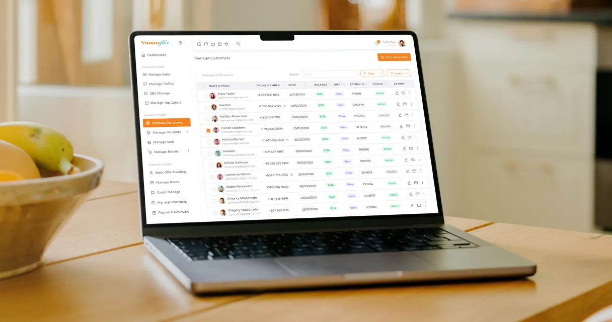
UI UX Design
Vomoz


The Roadmap
The UX UI design process for Vomoz is divided into four stages:
Research
Conduct user research to understand the target users, their needs, behaviors, and pain points. Methods include surveys, interviews, observation, and looking at analytics.
Wireframing
Create low-fidelity wireframes to outline the layout, interface elements, content, and user flow. Wireframes focus on function over aesthetics.
Prototyping & Testing
Build interactive prototypes to simulate the user experience. Conduct usability testing to identify issues and refine the design based on user feedback. Iterate until ready to develop.
Visual Design
Develop the visual language and aesthetic through color, typography, imagery, iconography, animation, and microinteractions. Create high-fidelity mockups.
User Testing
Conduct usability testing with real users to gather feedback on the prototype's functionality and user experience.
Iteration and Refinement
Analyze user feedback, identify pain points, and refine the design accordingly. Iterate through design and development cycles to enhance the product's quality.
![[object Object]](/_next/image?url=%2F_next%2Fstatic%2Fmedia%2FmainImg2.64436c67.webp&w=3840&q=75)
02. USER EXPERIENCE
Our main goal was to create a website that is user-friendly and easy to navigate. We started by conducting thorough research on the target audience to better understand their needs and preferences. Based on our research, we created a user persona that helped guide our design decisions. To enhance the user experience, we implemented a clean and minimalistic design with a simple color scheme. The website's layout was designed to be intuitive and user-friendly, with easy-to-use navigation and clear call-to-action buttons. We also made sure that the website was fully responsive to ensure that users could access it from any device.
03. USER Interface
For the user interface, we implemented a modern and professional design that aligned with VomozFlex's brand identity. The website's color scheme was based on the company's logo, and we used high-quality images and graphics to enhance the visual appeal of the website. We designed the website's homepage to provide users with all the information they need to understand the service and its benefits. We included a prominent call-to-action button that encourages users to sign up for the service. The website's layout was designed to make it easy for users to find the information they need. We created separate pages for the different services that VomozFlex offers, such as local numbers, virtual numbers, and flash-me credits.
![[object Object]](/_next/image?url=%2F_next%2Fstatic%2Fmedia%2FmainImg3.a40ba346.webp&w=3840&q=75)
04. Conclusion
Overall, we are proud of the UX UI design we created for the VomozFlex website. We believe that our design provides users with an exceptional experience that aligns with the company's brand identity. The website's user-friendly interface and intuitive layout make it easy for users to navigate and access the information they need.
“International calling requires a flawless user experience, and Peacock India nailed it. We had issues with complex account management, but they streamlined everything into intuitive flows that our global customers love.”
“Support tickets have dropped dramatically because the interface is so much easier to navigate. Their technical precision has made our service much more reliable for users everywhere.”

Product Team
Vomoz


