Mobile App
Torc

01. Introduction
Torc, a prominent brand known for its roadside assistance, aimed to modernize their services by developing a mobile app. This app would simplify and streamline the process of customers requesting help while on the go. Given the increasing adoption of smartphones, they approached us to design an app that was intuitive and user-friendly. Our goal was to provide added value to their customers during times of need. Excited to revolutionize the roadside assistance experience, our team enthusiastically undertook the task of developing this mobile app.

The Roadmap
Managing cloud and servers requires moving through key stages
Research and Planning
Conduct market research to understand the target audience and analyze competitors. Use insights to set goals, plan features, and budget resources.
Optimizing User Experience
Design an intuitive user interface. Build wireframes and user flows, then test with real users to ensure the app is easy and enjoyable to use.
Visual Design
Create an appealing visual design system including color palette, typography, icons, and graphics that bring the app to life.
Building a Solid Foundation
Use best practices to develop a robust, high-quality codebase. Conduct ongoing testing to catch issues early. Fix bugs quickly.
Testing and Refinement
Thoroughly test all aspects of the app manually and automatically. Identify areas for improvement and optimize the user experience.
Deployment and Upgrades
Publish the polished app then provide ongoing maintenance, updates, and customer support to keep delivering value.
![[object Object]](/_next/image?url=%2F_next%2Fstatic%2Fmedia%2FmainImg2.04478e87.webp&w=3840&q=75)
02. USER EXPERIENCE
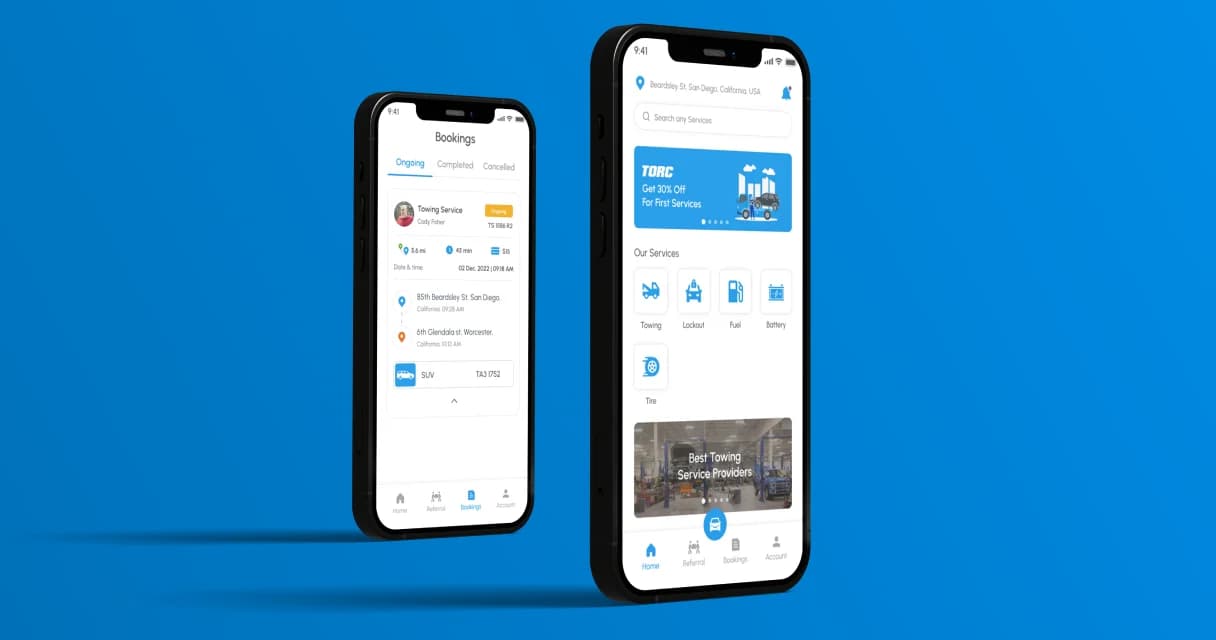
To create the best user experience, we started by deeply studying the people Torc wanted to help. Our research about how people use the app showed that what they want most is for it to be easy, quick, and always work well. We listened carefully to what we learned and used it to make a simple and effective experience. The app can find where the car is very fast because it knows where the GPS is. If someone needs help, they can ask quickly with just a few taps in the app. The app is easy to understand, especially when people are in a hurry by the side of the road. It lets people choose things like getting their car towed, changing a tire, getting a jumpstart, getting gas, and more. This simple app helps people get help really fast when they're in a tough spot by the road.
03. USER Interface
In addition to making things easy to use, our team of designers also worked on making everything look great. This means the way everything looks and works was designed to make customers happy. The colors, fonts, and how things are laid out all follow Torc's style guide, and they're made to work well on both small phones and tablets. The way everything is organized makes it easy to find what you need without any trouble. Buttons and menus are put where they make sense, so you can do what you want quickly. The colors and letters used make things easy to see and remember. And no matter if you're using a phone or tablet, things will always look and work the same way. All of this makes the app easy to use and helps customers get what they need without any confusion.
![[object Object]](/_next/image?url=%2F_next%2Fstatic%2Fmedia%2FmainImg3.cfc906e9.webp&w=3840&q=75)
04. Conclusion
The mobile app we created has brought a lot of benefit to Torc. It made asking for help on the road much easier and better. Since it started, many people have been using it and they really like it. The app looks simple and works well, and it has helped Torc stand out and make their service better. We're really happy to have worked with Torc and made their idea of a helpful app come true, making it easier for drivers when they need help.
“Peacock and his team helped convert our traditional business into a highly efficient mobile app. In our industry, when drivers are stranded, every second counts, and the app he built for Torc is clean, fast, and reliable.”
“Customer satisfaction jumped immediately because the technology performs perfectly under real pressure. He understands the urgency of our work and built a tool that supports our team when it matters most.”

Product Strategy Team
Torc


