Mobile App
Goom Express

01. Introduction
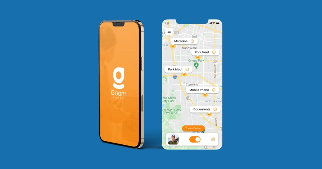
Let's step into the world of Goom Express. They had a vision: to make deliveries way better with a mobile app. Why? Well, they saw the struggles people go through with deliveries and thought, 'We can fix this!' They teamed up with Peacock India to turn this idea into reality - an app that's not just easy to use, but also fits exactly what you need. This app would handle orders, keep track of everything, and make sure deliveries run like a charm. Imagine it: waiting for your stuff to arrive, not sure where it is or when it's coming. Goom Express wanted to fix that with their app. And guess what? We were super excited to jump in and make it happen. So, with a lot of excitement and creativity, we took Goom Express' idea and turned it into an awesome app that's changing the delivery game for the better.

The Roadmap
Managing cloud and servers requires moving through key stages
Research and Planning
Conduct market research to understand the target audience and analyze competitors. Use insights to set goals, plan features, and budget resources.
Optimizing User Experience
Design an intuitive user interface. Build wireframes and user flows, then test with real users to ensure the app is easy and enjoyable to use.
Visual Design
Create an appealing visual design system including color palette, typography, icons, and graphics that bring the app to life.
Building a Solid Foundation
Use best practices to develop a robust, high-quality codebase. Conduct ongoing testing to catch issues early. Fix bugs quickly.
Testing and Refinement
Thoroughly test all aspects of the app manually and automatically. Identify areas for improvement and optimize the user experience.
Deployment and Upgrades
Publish the polished app then provide ongoing maintenance, updates, and customer support to keep delivering value.
![[object Object]](/_next/image?url=%2F_next%2Fstatic%2Fmedia%2FmainImg2.b479b3e1.webp&w=3840&q=75)
02. USER EXPERIENCE
One of the main things we concentrated on for a better user experience was coming up with a smart way to deliver orders. We used AI to group several orders from nearby places together for one delivery driver. This saved users both time and money. Besides the AI system, the design of the user experience is simple and made to fit individual needs. People can quickly pick delivery times whenever they want, or plan ahead. They can also keep an eye on their orders in real-time and get updates on how things are going. The personal profiles let users save where they like things delivered and how they pay, so they can get through the checkout process fast. All these special features are designed to give users the best experience possible.
03. USER Interface
The Goom Express app's design is simple and neat, making it easy for users to find their way around. Calming colors and clever icons make it simple to see and use important parts of the app. On the main screen, you can see recent stuff you did, and the menu quickly takes you to follow your orders, manage deliveries, and do other important things. The design also includes things like organized layouts, clear groups of things, big buttons to tap, a consistent look, and a design that works on different devices. All of these things together make sure the app feels just right for each user.
![[object Object]](/_next/image?url=%2F_next%2Fstatic%2Fmedia%2FmainImg3.784f12ca.webp&w=3840&q=75)
04. Conclusion
The Goom Express app we created has made a big difference by making deliveries better and more efficient. We used smart technology and easy-to-use design to make it special. Because of these changes, more people are using the app and liking it. We're really happy to have turned Goom Express' idea of a top-quality delivery app into reality by focusing on what people need.
“Speed is everything in delivery, and Peacock India certainly delivered for us. We were struggling to manage our high volume, so they engineered an app capable of handling thousands of daily orders without breaking.”
“Driver coordination is now seamless, and our customers love the real-time tracking features. Our marketplace growth has exploded thanks to their technical dedication and ability to solve complex logistics problems.”

Operations Leadership
Goom Express


